Tabs

January 24, 2011

Week 3: Spirituality


The work we have been previewing in class this week has been in the medium of fibers. The class, myself included, had only a limited understanding of the scope and application of this medium and the many ways in which it has been used to create discourse on domestic issues,

feminism, and slavery. This is only a sampling of the many topics that fibers can be applied to.

To me, what sets fibers apart from any other medium is its strength. The idea that I am fascinated with about thread is the idea of smaller bits of thread condensed into a structure that creates strength. Thread can be used to hold something together, attach something, or to connect one point to another. However, once the thread is unraveled and split, the strength is gone. Therefore, fibers are also a transitory medium. This gives the artist a lot of flexibility in their message. It can also be said that fibers have a unifying, communal quality to it that no other medium possesses. One of the artists we have studied this week, Ann Hamilton, works in many different mediums besides fibers, but she approaches her work from a fibers standpoint. In the PBS documentary series, Art 21, Hamilton says of fibers:

"The metaphors that the cloth offer up are really, extraordinarily beautiful because every piece of cloth that we wear is made up of all these individual threads, whatever their weave, and that each one of those is still something that you can see. And the whole cloth kneads (needs) each one of those. SO it's a social metaphor for me, and it's actually very beautiful." (00:04:04 - 00:04:31)

One of Hamilton’s work, Linement, done in 1994, is one such example where she approaches words from a fiber standpoint. She actually lifts the lines in a book from the page and wraps these strands of paper into balls. When I think about it further, I see no fundamental distinction between words and letters and abstractions. The letter, "a" does not point to the sound or the component that makes up the word. It is just a shape of lines put together in a certain way that we register the concept that it is referring to: that is, the concept of the letter. We have been conditioned so well to no longer see letters as shapes. This is the notion that

Hamilton is playing with.

Contemporary art plays with every aspect of the physical world. In this work, Ann is actually lifting a flat, two-dimensional plane and creating a three-dimensional space with it. Once an object is changed so fundamentally, it interacts with the environment differently. The idea of playing with space is also an concept that artist Cai Guo-Qiang plays with in his installation work. It becomes something that moves around you and you around it, something that you develop a personal relationship with. Once the space is animated, don't know what that space will do to you. This sense of the uncertain is in strong contrast to a finished painting or flat surface. A visceral space is something you can walk into in one state, and leave in another.

Cai studied stage design at the Shanghai Drama Institute, which has deeply informed his installation work. He approaches every installation as a theatrical scene frozen in time. It is as though time stopped the moment you approached the work. To attempt to discuss or describe
his works with mere words do not do justice to the epic quality of it.

"Art is not about what you say. It's about those things you don't say."

Stage setting. Theatrical, visual impact that you enter into. And it's through visual impact that this pain is felt.


To be able to see this in person, to become a part of the performance, to become a part of the installation, to move through the environment, is truly powerful. Seeing these on video or in pictures does not do the work justice. They must be experienced in order to experience the full effect. These are overwhelming, beautiful, majestic in a melancholy and beautiful decay.


Decomposition, nostalgic, sentimentality, suspended in antiquity.

I am truly grateful to have had the privilege of seeing these works in person at Cai Guo-Qiang's show at the Guggenheim Museum in New York City.

I remember when I was an art student going to school in New York. The school was only 20 minutes away from central Manhattan, so it was a relatively short distance to access the dozens of world-class art museums that were in the city. Our teacher brought us on outings to the Natural History Museum, the Metropolitan Museum of Art, the Whitney Museum of Art, The Neue Gallerie, The Guggenheim, the Cooper Hewitt. These were all the museums we went to BEFORE our professor would bring us to the MoMA. She said that the MoMA was what we were working up toward, because in order for us to fully appreciate the MoMA, we had have practice of seeing art. Experiencing the MoMA is something that asks a lot from you, it demands a lot of effort on the part of the student to fully appreciate the work in there.

I have not really touched on this work as much as I would have liked to. However, my blog post is due in 5 minutes. I will discuss Cai and Hamilton's works in more detail in later supplementary blog posts and comments on this one.

January 23, 2011

El Guincho - Bombay

This has to be one of the most amazing music videos I have ever seen.
It is always a real treat to watch a music video that can also be seen as art.

"The cosmos is all there is,
or ever was, or ever will be.
The cosmos is also within us.
We are made of stars.
We are about to begin a journey through the cosmos.
Through the story of our own planet,
and the plants and animals that share it with us.
It's a story about us.
We wish to pursue the truth, no matter where it leads.
But to find the truth we need imagination and skepticism both.
We are going to explore the cosmos in the ship of the imagination.
Perfect as a snowflake,
Light as a feather,
The ship will take us to worlds of dreams, and worlds of facts.
Come with me."

El Guincho - Bombay


The musician's name is Pablo Diaz-Reixa, who goes by the name of El Guincho.

The work is about wonder and discovery, as you see, Guincho documenting the sights and sounds around him with his field recorder in hand, playing the part of anthropologist to these new sensory images.
It is a journey that exists out of time and in no particular order. It exists within reality and beyond reality.

If you're more curious to find out about this artist, here is a video from XLR8R tv channel on Youtube of Pablo talking about his influences.

January 20, 2011

Week 2: Signs

Entry 2: Signs

For the second official entry to my blog, I feel that it is appropriate to discuss the idea of signs.

For the last week, we have, if not explicitly, been surveying the art of signs, starting with the work of Margaret Kilgallen and Barry McGee, who cited the hand-painted signs dispersed throughout San Francisco as a source of inspiration.
Signs act as a visual mandate, communicating a clear directive or statement in the visual language. Signs existed before the use of an organized writing system, and even these systems were formed from a set of symbols. When considered this way, signs are the only non-verbal form of communication.

There are some signs that we immediately associate with certain qualities. For example, below are two shapes. Each of these shapes have the names Kiki and Bobo. Which shape do you associate as Kiki, and which one as Booba?


Most of you probably called the shape with sharp angles Kiki, and the shape with round, fluid edges Bobo. I find it fascinating that we have the ability to associate a shape with its corresponding idea so instantaneously. Scott McCloud covers this idea in a chapter of his book, Understanding Comics. For him, comics are a form of visual communication, so to cut down on excessive written description, comics employ the use of visual signs to mean certain ideas.

Why is it that there are some objects that we recognize as symbols and some that we don't? Is it the reduction of an object alluding to an expansive subject/concept?


Sometimes, symbols allude to a concept, or idea. This sign is interpreted by most to mean "no smoking." The red is perceived by most to imply something urgent. A cross over an image implies a restriction, or mandate. The idea that people register this abstraction instantaneously is a true miracle of the mind. However, the sign could be seen in so many different ways. When I was young, I always thought that the puff of smoke as some kind of a creature, because I distinctly recall thinking that smoke does not look like that when it rises, at least from what recalled. The smoke cloud actually looked like a worm coming out of a tube. Or perhaps the front end of a train engine, smoke billowing out of the steampipe. It could also resemble a factory with no windows with two smokestacks on the right-hand size. However, I don't think the people who have to work in the factory would like working with no outside light, so I made a factory and added windows to it. It would be depressing without windows and I wanted to do something nice:


It is amazing that those two lines seem like they're formed perfectly, meticulously rendered while being conceptually fluid.

Why do we accept this SYMBOL as the appropriate allusion to the concept?

Another person who extensively employs signs in his art is Michael Salter. Salter is the Associate Professor of Digital Art in the art department at the University of Oregon, of which it is an honor to have such a creative, talented person working for this school. On Tuesday, Michael Salter presented a lecture about his work to the class. Salter can only best be described in a term coined by Dan Brown of DaVinci Code fame: A Symbologist. One who studies symbols. At least, that's what I conclude from what the name is. The only existing symbologist is Robert Langdon, and as far as I know, there is no such legitimate profession as Symbology. If that were so, there would be many graduates majoring in symbology who would have a hard time finding employment once they left the university institution.

Anyway, Salter spent the first part of his lecture discussing the visual messages that stood out to him ever since he was growing up. Through his lecture, we developed an understanding of the various circumstances that an artist grows up in can shape his perception of the world. He saw the world in terms of symbols, which has translated to his profession in designing logos and signs. As for making a career in the digital arts, he did not sugarcoat the hard work and effort that must be put into it. He owes his success to the value of hard work, not by what he said, but by his actions and what he did. By college, he was already paving his own path in the world of art by starting a graphic design company with some friends in college and seeking clients on their own volition.

One of the qualities I enjoy most about this art course is that no single lecture is ordinary, or presented to us in an ordinary manner. What I value most from taking this course is that simply being in a proximity of creative people, I start feeling creative myself. It's as though their creativity floods out of them and some of it gets soaked up by me. I get creative by association.

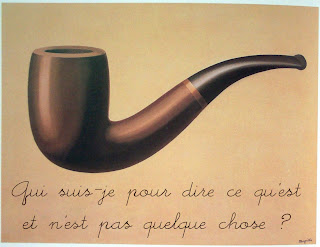
So I want to conclude this post with probably one of the most prominent discourse-starters regarding the concept of symbol. I'm sure you will recognize the image below, but read closely.


Translation: "Who am I to say what something is and isn't?"


Fin.


"I could paint a killer sunset, or a great lighthouse, but I don't feel like doing that. I want to do what I want to do, and that happens to be making signs."

-Michael Salter

January 14, 2011

CL!CK: Lego

Many of you must remember when you were children and played with Legos.

When you played with Legos, being creative seemed effortless. Time passed by so quickly while the ideas flowed out and worlds were constructed from your imagination. The versatility of the little bricks allowed any idea to be realized, even ones that may have not occurred to you before.

At some point, maybe you started thinking that you had outgrown using Legos and instead replaced the use of those colorful bricks with something considered more "mature", like plywood and glue.

Oh, how we deceived ourselves.

There is no unacceptable way to release your creativity and the truth is, Legos are still an amazing outlet for helping you find your inspiration.

The web site, CL!CK, is dedicated to the ideas that Lego has helped to inspire, and these videos made for CL!CK capture that feeling of wonder when you create.


CL!CK: A LEGO Short Film


The Brick Thief: A LEGO Short Film


Enjoy.

Andrew


January 13, 2011

Visuals by TNUC

I'm hoping that over time, my blog entries will increasingly improve, both in my expertise and the quality of the content. Sometimes, commenting on art is boring and it is difficult to offer a novel insight that hasn't been said before. In addition to writing weekly blog entries for art class, I also want to use this blog to talk about other art that interests me or that has gotten my attention.

I want to first shine the visual spotlight on a blogger who goes only by the name TNUC. TNUC juxtaposes scenes from retro 80's movies in such a way that it creates a visual sequence I cannot describe in any other way but with a made up word combining "awesome" and "epic": AWESOMEPIC. The retro electro music is the perfect accompaniment to the video. It's as though everything that made the 80's cool and fun was tossed into a blender, resulting in a dizzying melange of good times and obnoxiously fluorescent colors. For more TNUC videos, check out his
blog and visit his Vimeo page. (Second Vimeo page as well)


You need more friends. Become friends with TNUC on
Facebook.


Cheers,

Andrew

January 12, 2011

ENTRY 1: TYPE

This is the first blog entry for my blog that I have set up for the course ART 101: Understanding Contemporary Media. For the purposes of writing more concisely, each of my blog entries will focus on a central theme that I have observed throughout the week. For my first entry, I will be focusing on the theme of type.


Over the past week, our class has viewed many works that use type to convey messages that go beyond the words themselves. At what point do words cease to function as simply words and take on the qualities of signs and symbols? Words have often been considered distinct from images, but some artists attempt to blur

this distinction.


Typography produces an emotional response independent of the words themselves. The shape of a letter affects how one reads the words and alters the message. It can be as individual as a signature.


One of the artists we first observed inclass explores innovative ways of presenting words to take on new meaning. Jenny Holzer was formally trained in printmaking and her material is solely text-based. The work that she has received much attention for is her projections.


She writes phrases (or more recently, has been borrowing writing from other authors and poets) and uses projectors to shoot them onto surfaces such as buildings and rivers, transforming into surfaces. In an average context, the words could be considered ordinary or banal. Once they are inflated to phenomenal proportions, however, they penetrate the physical world, inhabiting it with other humans.


The words take on their own personality and demand notice. It is difficult to observe them passively, especially when they tower o

ver you often at more than 6 stories high. Reading is no longer a personal experience, like reading a book is. It becomes a shared experience.


Street art operates on roughly the same principles. Instead of confined to the exclusivity of a gallery space, street art is accessible to everyone, which alters the meaning of the work. While Jenny Holzer chooses to alter the meaning of her words by manipulating their size, other artists obsess with manipulating the font to create a new message. In an interview on Art21, Margaret Kilgallen comments that her art is influenced by old typography from the 15th and 16th century history books.

Her work looks like old hand-painted signs from the the first half of the 20's century, serif letters painted in a limited color palette that are flowing while simultaneously stiff and concrete.

The type she uses is as individualized as a signature, all done by hand so the writing is never monotonous. The work of her husband, Barry McGee, is similar in its use of type to create a nostalgic representation of a lost era. They use type not as words, but as signs.


Both Kilgallen and McGee's work reminds me of two other artists that I have seen: Faith Ringgold and Ralph Fasanella. These artists were represented by an art gallery I used to work at called ACA Galleries in New York City, where I used to live.

They were represented by the gallery, which specialized in American folk art. The similarities I see are inthe warm, earthy colors and the rigid shapes of the figures.


The line in drawing is similar to a type: It, too, lays down rigidly, but in a unique way. No one line is ever the same as another. In lecture on Thursday, Professor Laura Vandenburgh from the Department of Art presented a lecture on drawing. Many of the examples that she showed used text in the work. Some of the works were hybrids of text and image, swirling around one another, mutually dependent on one another. Since that lecture, my conception of what constitutes drawing has expanded immensely. My working definition is no longer defined as writing implement on paper. Rather, drawing is a conceptual idea of how line interacts with surface. In drawing, it is rigid; there is never a sense of completeness. The line can be manipulated and altered ad infinitum. With type, the line can be mutated into a shape that no longer resembles a letter; it takes on the characteristics of a sign.