For the second official entry to my blog, I feel that it is appropriate to discuss the idea of signs.
For the last week, we have, if not explicitly, been surveying the art of signs, starting with the work of Margaret Kilgallen and Barry McGee, who cited the hand-painted signs dispersed throughout San Francisco as a source of inspiration.
Signs act as a visual mandate, communicating a clear directive or statement in the visual language. Signs existed before the use of an organized writing system, and even these systems were formed from a set of symbols. When considered this way, signs are the only non-verbal form of communication.
There are some signs that we immediately associate with certain qualities. For example, below are two shapes. Each of these shapes have the names Kiki and Bobo. Which shape do you associate as Kiki, and which one as Booba?

Most of you probably called the shape with sharp angles Kiki, and the shape with round, fluid edges Bobo. I find it fascinating that we have the ability to associate a shape with its corresponding idea so instantaneously. Scott McCloud covers this idea in a chapter of his book, Understanding Comics. For him, comics are a form of visual communication, so to cut down on excessive written description, comics employ the use of visual signs to mean certain ideas.
Why is it that there are some objects that we recognize as symbols and some that we don't? Is it the reduction of an object alluding to an expansive subject/concept?

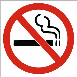
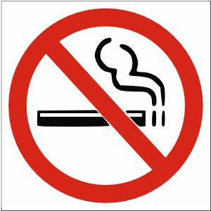
Sometimes, symbols allude to a concept, or idea. This sign is interpreted by most to mean "no smoking." The red is perceived by most to imply something urgent. A cross over an image implies a restriction, or mandate. The idea that people register this abstraction instantaneously is a true miracle of the mind. However, the sign could be seen in so many different ways. When I was young, I always thought that the puff of smoke as some kind of a creature, because I distinctly recall thinking that smoke does not look like that when it rises, at least from what recalled. The smoke cloud actually looked like a worm coming out of a tube. Or perhaps the front end of a train engine, smoke billowing out of the steampipe. It could also resemble a factory with no windows with two smokestacks on the right-hand size. However, I don't think the people who have to work in the factory would like working with no outside light, so I made a factory and added windows to it. It would be depressing without windows and I wanted to do something nice:

It is amazing that those two lines seem like they're formed perfectly, meticulously rendered while being conceptually fluid.
Why do we accept this SYMBOL as the appropriate allusion to the concept?
Another person who extensively employs signs in his art is Michael Salter. Salter is the Associate Professor of Digital Art in the art department at the University of Oregon, of which it is an honor to have such a creative, talented person working for this school. On Tuesday, Michael Salter presented a lecture about his work to the class. Salter can only best be described in a term coined by Dan Brown of DaVinci Code fame: A Symbologist. One who studies symbols. At least, that's what I conclude from what the name is. The only existing symbologist is Robert Langdon, and as far as I know, there is no such legitimate profession as Symbology. If that were so, there would be many graduates majoring in symbology who would have a hard time finding employment once they left the university institution.
Anyway, Salter spent the first part of his lecture discussing the visual messages that stood out to him ever since he was growing up. Through his lecture, we developed an understanding of the various circumstances that an artist grows up in can shape his perception of the world. He saw the world in terms of symbols, which has translated to his profession in designing logos and signs. As for making a career in the digital arts, he did not sugarcoat the hard work and effort that must be put into it. He owes his success to the value of hard work, not by what he said, but by his actions and what he did. By college, he was already paving his own path in the world of art by starting a graphic design company with some friends in college and seeking clients on their own volition.
One of the qualities I enjoy most about this art course is that no single lecture is ordinary, or presented to us in an ordinary manner. What I value most from taking this course is that simply being in a proximity of creative people, I start feeling creative myself. It's as though their creativity floods out of them and some of it gets soaked up by me. I get creative by association.
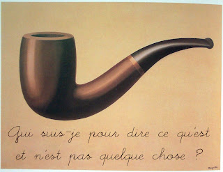
So I want to conclude this post with probably one of the most prominent discourse-starters regarding the concept of symbol. I'm sure you will recognize the image below, but read closely.

Translation: "Who am I to say what something is and isn't?"
Fin.

"I could paint a killer sunset, or a great lighthouse, but I don't feel like doing that. I want to do what I want to do, and that happens to be making signs."
-Michael Salter
Hi Andrew! I just want to say that I love this post! I love how you talked about what the reading talked about without saying "this is what I learned from the reading." And thanks for giving those poor factory workers some daylight.
ReplyDeleteI thought you should know that your French translation is a little off. It actually says "Who am I to say what is and is not something?" Here's what google translate said you should change it to: "Qui suis-je pour dire ce que quelque chose est ou n'est pas?" Not that you need my help, or asked for it, but take it or leave it :).
Thanks for letting me stalk your blog!
Liza
Andrew - you need to address more thoroughly each of the components provided during the week. Make sure you are referencing the current resources - this week's multimedia artist was Chris Coleman. Great overarching theme and reflection, though!
ReplyDeleteAndrew--
ReplyDeleteThat discussion of Kiki and Bobo was pretty fascinating. I wonder what would happen if you kept the icons exactly the same, but introduced the names in reverse order (Bobo and Kiki)-- would that have an impact on which character gets what name?